Ikonra Studio designs logos, identity systems and rebrands for startups that want to look as serious as the product they are building. Every mark is drawn to read at 16 pixels and hold up on a billboard.
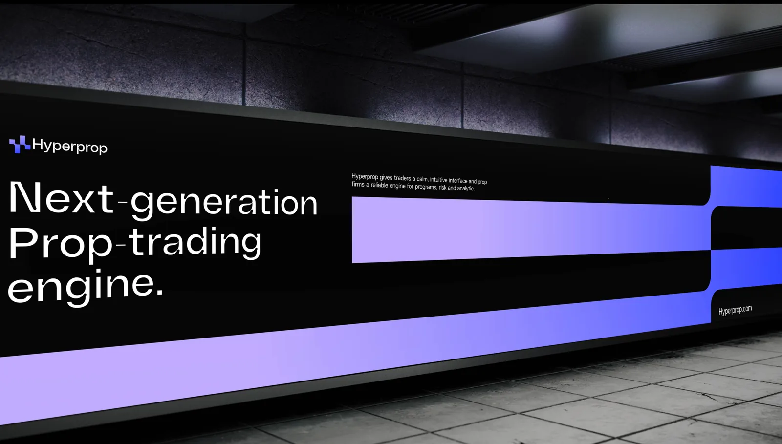
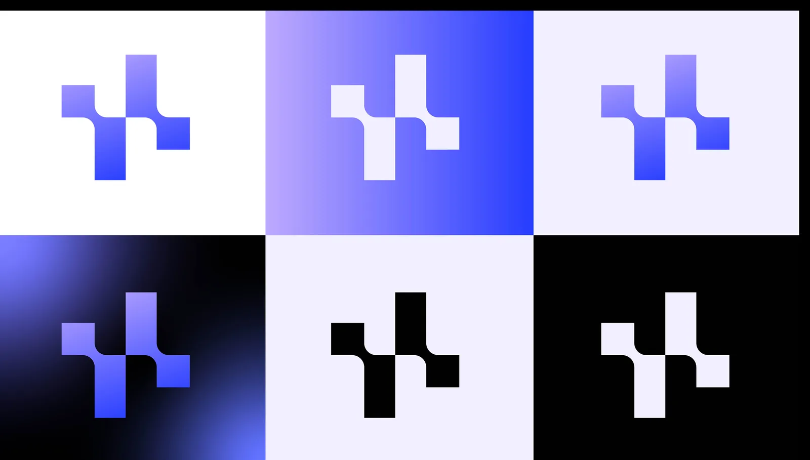
An abstract H built from positive and negative space with softened corners, drawn to read from a 16px favicon to a billboard.
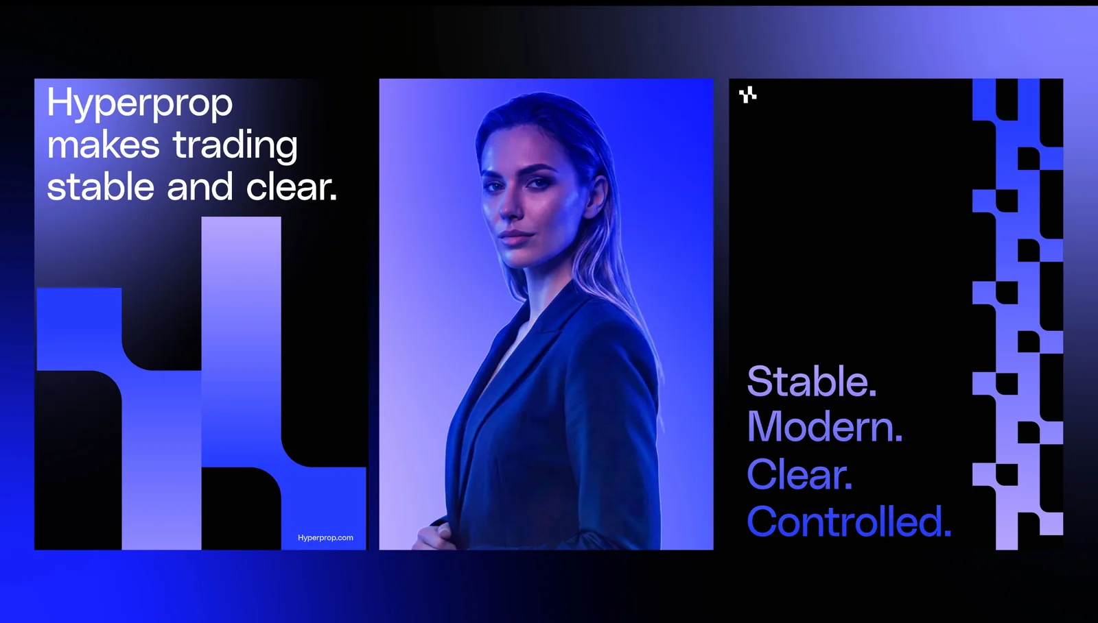
Page Black, Royal Blue, Soft Purple and Pearl White, set in Manrope.
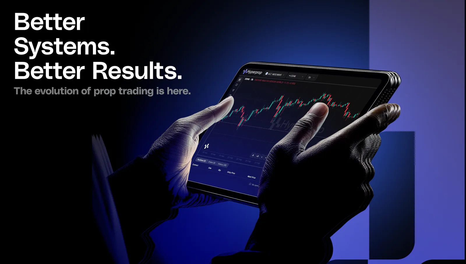
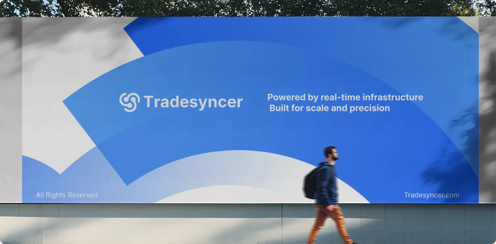
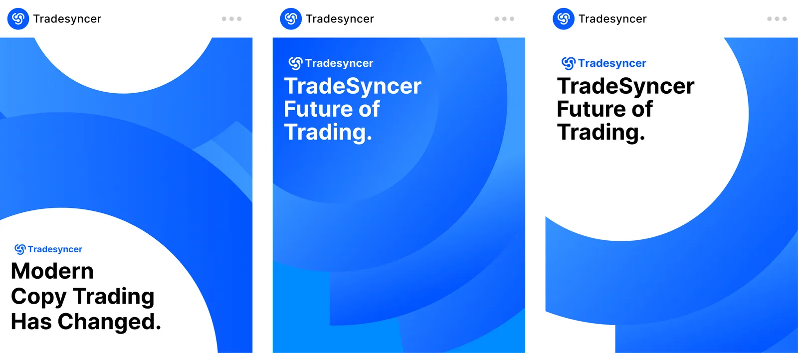
The identity runs across out-of-home, campaign posters, social, the app icon and product screens.
Motion: the presentation cycles logo, palette, type and applications; the symbol rises in strip by strip, then the wordmark wipes on.
Ink#0A0E1A
Navy#08113F
Royal#0457FF
Blue#156AFF
Surface#F4F6FB
White#FFFFFF
Typeface · InterAa.Every account. Always in sync.ABCDEFGHIJKLMNOPQRSTUVWXYZ abcdefghijklmnopqrstuvwxyz 0123456789
Tradesyncer
Trading software for prop firm traders · Fintech · Rebrand
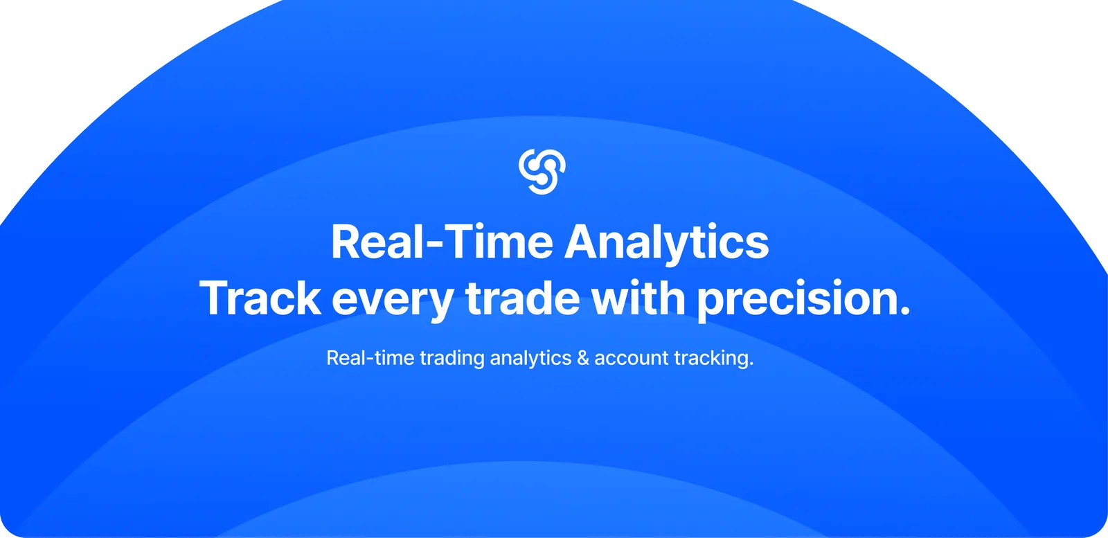
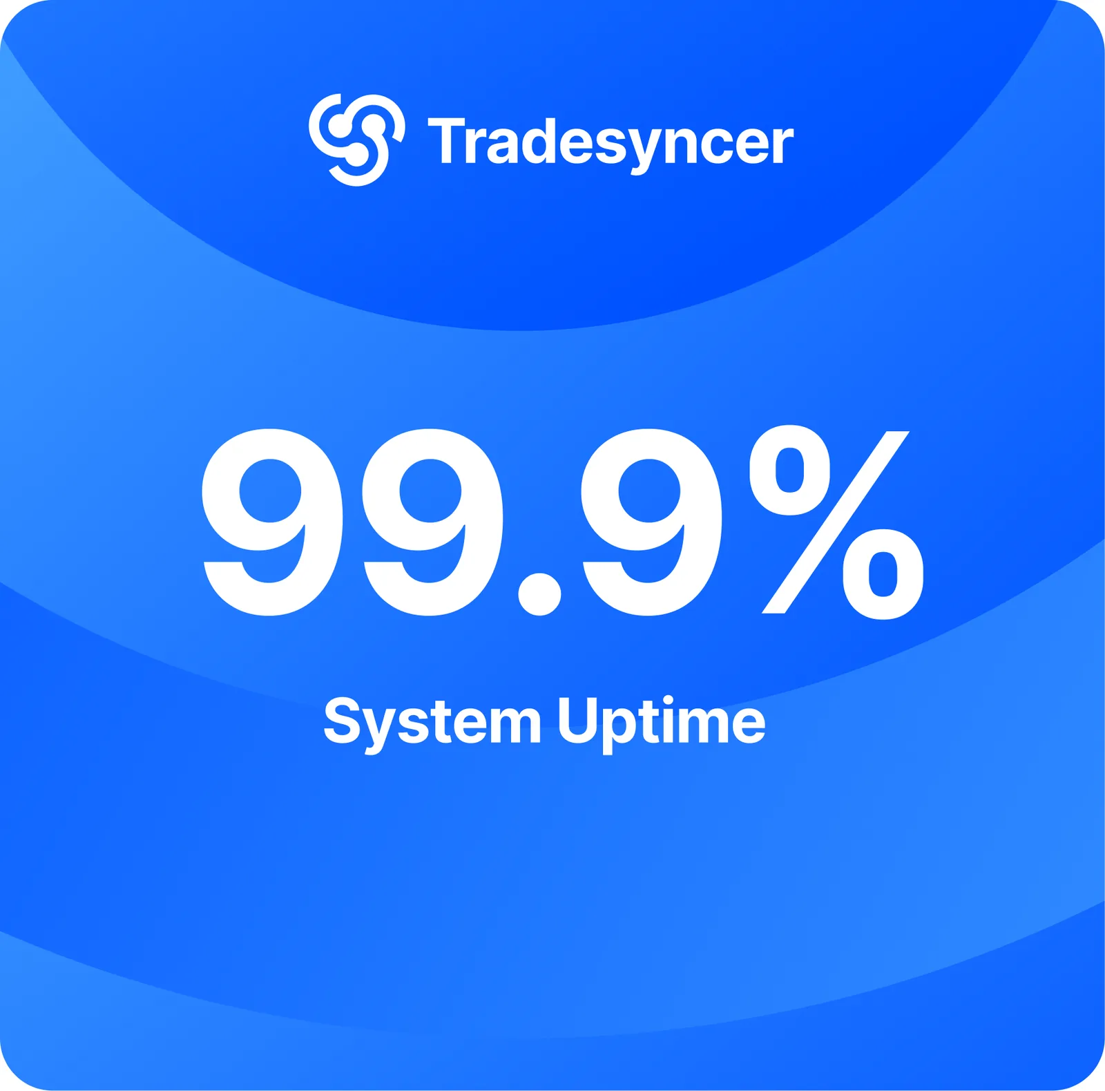
A rebrand for software that keeps prop firm traders’ accounts in sync.
A looped symbol turning around one centre, paired with a bold, compact wordmark.
Royal and bright blues on deep ink and navy, with Inter for headlines and body.
Motion: the symbol turns one full revolution and the wordmark wipes in.
●
Tessel
Workflow infrastructure for operations teams · SaaS
Four 48-unit tiles on a 100-unit grid with a 4-unit gutter.
Each tile carries a quarter disc anchored to its outer corner; together they leave a four-point star in negative space.
Motion: the tiles flip 180° in sequence, turning the star into a solid circle and back. One system, two states.
●
Strata
Applied AI research lab · AI
A sphere built from eight horizontal bands on a 12.5-unit pitch.
Band weight grows from 3.4 to 12.5 units top to bottom, so the circle reads as a lit volume without any gradient.
The wordmark is set in wide-spaced Geist capitals with both As redrawn as bare peaks, open like the gaps between the bands.
Motion: the bands breathe in a slow wave, like a model scanning layer by layer.
●
Prop League
Rankings, tournaments and talent discovery for prop traders · Fintech · Logo
Logo for a rankings, tournaments and talent discovery platform for prop traders.
A slanted, faceted icon beside a wide, all-caps PROP LEAGUE wordmark.
Off-white on black, made for the site’s dark canvas.
Motion: the icon slides in on a skew and the letters drop in one by one.
●
Mothlight
Indie game studio · Gaming
A moth rasterised onto a 25-column pixel grid from a vector drawing: broad forewings, rounded hindwings and a long body.
A one-pixel channel separates the body from the wings, eye-spots are punched out of the forewings, and a diagonal seam splits fore from hind wing.
Motion: the wings beat while the moth hovers, drawn to the light.
●
Crumb
Neighbourhood sourdough bakery · Food & Drink
Bricolage Grotesque ExtraBold at 75% width, tracked tight and outlined.
A three-scallop bite, built from 15-unit circles, comes out of the c, the first letter you read.
Motion: crumbs tumble from the bite.
●
Bolt Motivation
YouTube channel · Media · Logo and wordmark
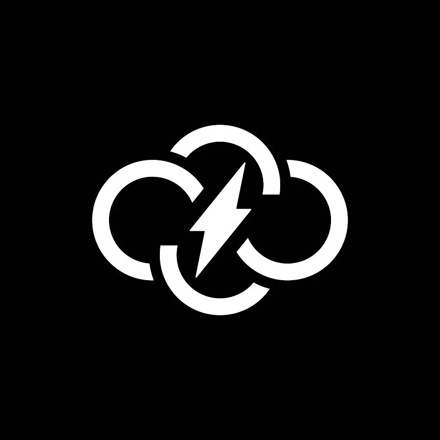
Logo and wordmark for a YouTube channel: a cloud-and-bolt mark and the “bolt MOTIVATION” lettering.
White on black, built to read at profile-picture size.
The wordmark is drawn lettering rather than a set typeface.
Motion: the bolt flashes and the mark pulses.
●
Loudhouse
Independent podcast network · Media
Seven 10-unit bars on a 15-unit rhythm, trimmed by a 44° gable line.
The centre bar stops short to open a door, so the roofline and the equaliser are the same drawing.
Motion: the bars play as a live audio meter, then settle back into the house.
●
Bastion
Endpoint security for growing companies · Cybersecurity
A shield crowned with three merlons: the security badge becomes a fortified wall.
The body is two mirrored halves, with the curve drawn from a 72-unit width and a 58° shoulder.
Motion: the halves slide together and lock.
●
Cadence
Team scheduling software · SaaS
A 4 × 4 grid of 19-unit slots on a 27-unit pitch; wherever a booking spans slots, the dots fuse into one capsule.
The same grid is a week planner and a rhythm pattern, with one coral block marking the booking that matters.
Motion: the bookings stretch out from their first slot one by one, the week filling up.
●
Serac
Technical outerwear for high altitude · Fashion
Archivo at 125% width, then redrawn: the A loses its crossbar and becomes a bare peak.
Named after the ice towers of a glacier: the bare A is the only drawn detail, so it carries the whole idea.
Letterspacing is set to 0.14 em so the mark holds up when stitched small on a garment tab.
Motion: the letters climb into place and the peak rises last, like a summit coming out of cloud.
●
Helio
Community solar co-operative · Energy
A 9 × 9 halftone grid on an 11.1-unit cell.
Square size falls off with radial distance, so a circle appears from nothing but squares, like a panel array seen from above.
The dot of the i is split into a 2 × 2 grid of cells, a tiny piece of the array.
Motion: energy pulses outward from the core.
●
Nocturne
Sleep and recovery app · Health
A crescent built from seven 8-unit capsule lines on a 13.6-unit pitch, like moonlight through blinds.
The terminator is a true 50-unit circle, so every line ends on the same curve and rounds off at its tip.
The o of the wordmark becomes a crescent.
Motion: the moon waxes towards full and wanes again, one phase per breath.
Selected logos and identities by Ikonra Studio.
Kind words
From the founders we work with
“Ikonra completely transformed the visual direction of TradeSyncer. The team understood the brand quickly, brought strong creative ideas to the table, and consistently delivered polished work. Their attention to detail and ability to turn ideas into strong visuals made them a huge asset to the project.”
RobertTradesyncer · Rebranding
“Working with Ikonra has been a great experience. They understand how to make complex products feel visually clear, premium, and engaging. From the branding to social content and creative assets, their work consistently raised the quality of Hyperprop’s visual presence.”
EduardHyperprop · Complete branding
“Ikonra took the time to understand the direction behind Bolt Motivation and turned it into a logo that feels modern, distinctive, and memorable. The team brought a strong eye for detail to the process and delivered something that feels genuinely aligned with the brand.”
MathisBolt Motivation · Logo design
“Ikonra made the entire logo design process simple and enjoyable. They understood what we wanted, explored the right creative directions, and delivered a logo that feels clean, confident, and true to the brand. I’d definitely recommend working with them.”
KuroOG Hoopers · Logo design
Services
What we design
Logo design, brand identity and rebrands for SaaS, fintech and funded startups. Each service page sets out what is included, from a single logo to a full SaaS or fintech identity.
01
Logo design
A symbol and wordmark built on one clear idea, drawn to hold up in a browser tab and on a billboard alike.
Symbol and wordmark
Lockups and colourways
App icon and favicon set
Vector master files
02
Brand identity
The whole system around the logo: colour, type, a signature graphic device and the rules that keep it consistent as the team grows.
Colour and typography
Signature graphic device
Icons and imagery direction
Brand guidelines
03
Rebrands
For companies that have outgrown the brand they launched with. We keep what has earned recognition and rebuild the rest.
Review of the current brand
Evolution or full redesign
Rollout across product and marketing
Updated asset library
04
Launch and social
What the brand needs on day one: social profiles, launch posts, campaign artwork and a deck that looks like the company you are becoming.
Social profiles and templates
Campaign and out-of-home artwork
Pitch and sales deck design
Launch mock-ups
05
Guidelines and handover
Everything packaged so your team, your developers and your printers can use the brand without us in the room.
A short brief, one strong idea and a brand your team can run without us.
01
start with the business
We study the product, the market and the people you sell to before we draw anything. Your brief sets the direction; we make sure the design answers it.
02
one idea, pushed further
We would rather bring you a few strong routes than a wall of options. Every route is tested at 16 pixels, on a phone and on a poster before you see it.
03
a system, not a file
You leave with a brand your team can actually run: files for every format, clear rules and launch assets ready to go.