← Journal · 5 min read
Designing a logo that works at 16px
Your logo spends most of its life smaller than a fingernail. Here's how we design marks that stay clear in favicons, app icons and avatars.
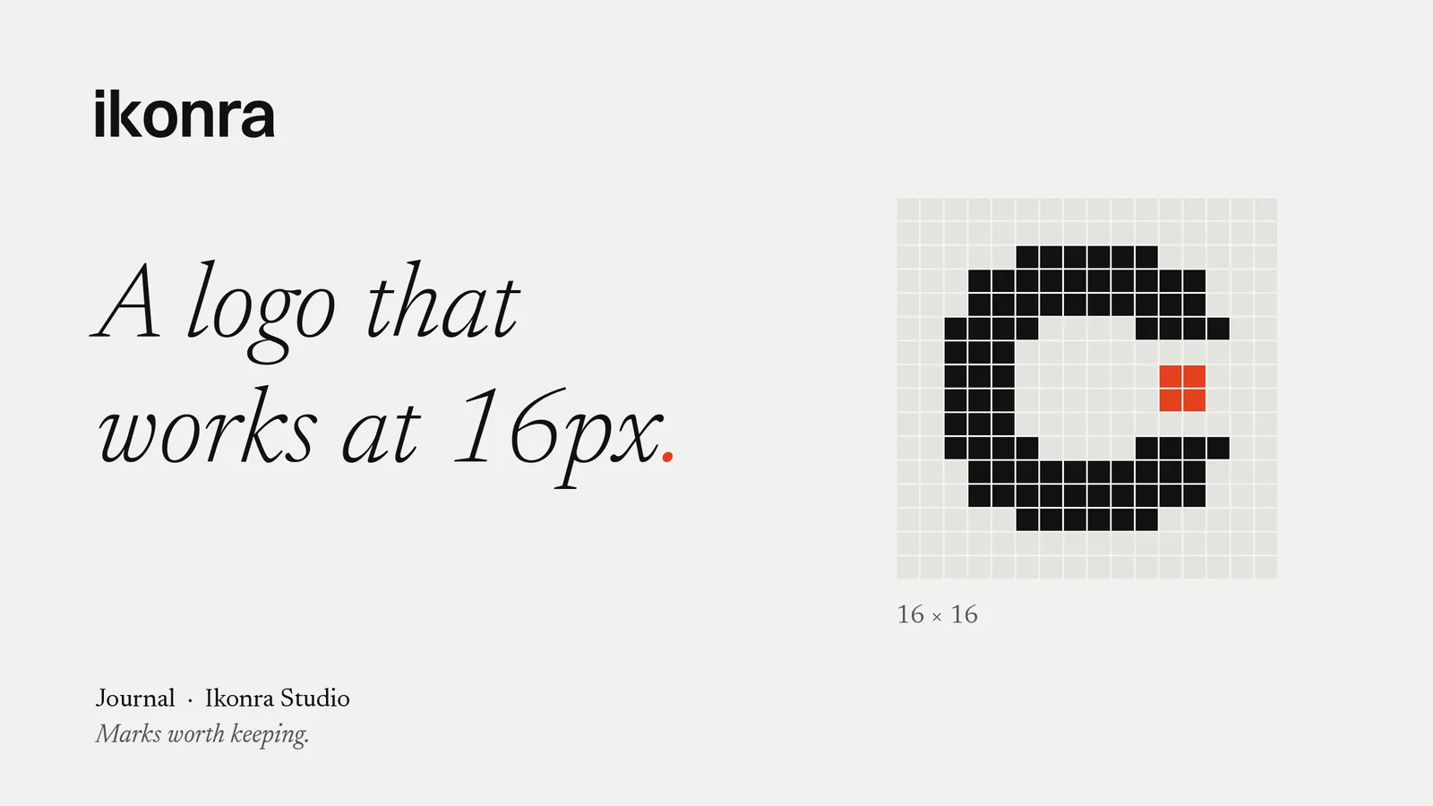
Most founders first see their new logo big: a full-screen presentation, a hero image, a mock-up on a billboard. That isn’t where it lives. Day to day, your mark sits in a browser tab, an app icon, a Slack avatar, a calendar invite and a line on a bank statement. Often at 16 pixels square, sometimes less.
If it falls apart there, it falls apart in most of the places people actually meet your company. Here’s how we design for small sizes from the first sketch.
Start small, not big
We test marks at their smallest size before we refine them at their largest. A logo that looks rich at 1,000 pixels can turn into grey mush at 16. Working the other way round is far kinder: a mark that holds together in a favicon almost always scales up gracefully.
In practice, every concept we show a client appears in a browser tab, on a phone home screen and as a social avatar, right alongside the big version. If it only works in one of those places, it doesn’t make the shortlist.
Count the shapes
At 16px you have 256 pixels to work with, and every extra element competes for them. A useful rule of thumb: if a mark needs more than two or three distinct shapes to be recognised, it will struggle when it’s small.
That’s why so many enduring marks are built on one strong idea. A single curve, a clean cut, a letterform with one unexpected move. Detail can live in the wider identity, in patterns, illustration and motion, but the core symbol should be simple enough to draw from memory.
Our Tradesyncer rebrand is a good example. The symbol is a handful of simple, bold shapes, so it holds up as a mobile header icon and an app icon as well as across the product banners and social graphics.
Watch the gaps
Small logos usually fail in the negative space, not the positive. Thin gaps between shapes close up as pixels blur together, and fine counters (the holes in letters like a, e and o) fill in.
When we refine a symbol, we check for:
- Gaps that are at least as wide as the strokes around them
- Strokes thick enough to survive anti-aliasing on an ordinary screen
- Counters open enough to stay visible on both light and dark backgrounds
When a mark needs heavier weights or wider gaps to survive at small sizes, we draw a dedicated small-size version rather than compromise the main one. Type designers have done this for centuries with optical sizes. Logos deserve the same care.
Separate the symbol from the wordmark
A wordmark rarely works at 16px. Seven or eight letters squeezed into a favicon become a smudge. This is one of the main reasons a SaaS brand benefits from a standalone symbol: something that can carry the brand where the name can’t fit.
A good identity system defines clear lock-ups:
- Primary lock-up: symbol and wordmark together, for the website header, pitch decks and documents
- Wordmark only: for places where the name needs to be read, such as press and partner pages
- Symbol only: for the favicon, app icon, social avatars and product interface
Each lock-up needs rules for minimum size and clear space, so nobody on your team has to guess.
Test it in the wild
Mock-ups are flattering. Real interfaces aren’t. Before we sign off a symbol, we drop it into the places it will actually live:
- A browser with a dozen other tabs open
- An iOS and an Android home screen, next to the apps your customers already use
- A dark-mode interface
- A LinkedIn comment thread and an X reply, where the avatar is tiny and surrounded by noise
- A low-resolution screen and a high-density one
The question isn’t “is it beautiful?” but “can I find it in a crowd?” If a user can spot your tab in a row of twenty, the mark is doing its job.
Mind colour and contrast
Colour helps recognition, but it can’t carry it alone. A mark should still read in a single colour, in black on white, and reversed out of a dark background. At small sizes, low-contrast pairings such as pale grey on white or navy on black simply vanish.
We choose a primary brand colour that keeps strong contrast against both light and dark interfaces, and we check the symbol in one colour before we ever add a gradient or a second tone.
How it came together for Hyperprop
Hyperprop is a futures prop trading platform, and its brand had to feel as sharp as the product. Traders meet it on a phone, in a browser tab, in social feeds and, at the other end of the scale, on out-of-home campaign posters.
We built a symbol that works as an app icon and at poster scale, a colour system led by royal blue, and a visual language that carries through the app, social and campaign work. The same mark does the job from the smallest screen to the biggest wall, which is exactly what a growing product needs.
A quick checklist before you approve a logo
Before you sign off a new mark, ask your designer, or yourself:
- Can I recognise it at 16px in a browser tab?
- Does it work in one colour, on light and on dark?
- Is there a symbol that works without the name?
- Are there clear lock-ups, minimum sizes and clear-space rules?
- Has it been tested in real interfaces, not just mock-ups?
If the answer to any of these is no, fix it now. Changing a mark after launch, once it’s on your app store listing, your investor deck and your customers’ home screens, costs far more than getting it right the first time.
Marks worth keeping
A logo that works at 16px isn’t a smaller logo. It’s a better-designed one: simpler, clearer and more confident at every size. That’s the standard we hold every mark to.
Planning a new logo or a rebrand? Send a brief to info@ikonra.com and we’ll come back to you with a proposal.
Logo design · Brand identity · SaaS · Startups
Related services: Logo design for startups · SaaS branding
Planning a new brand, a rebrand or a logo that needs to work harder? Send us a brief