← Journal · 5 min read
What a brand identity system actually includes
A founder's guide to the parts of a brand identity system, from logo suite to guidelines, and which pieces a startup needs first.
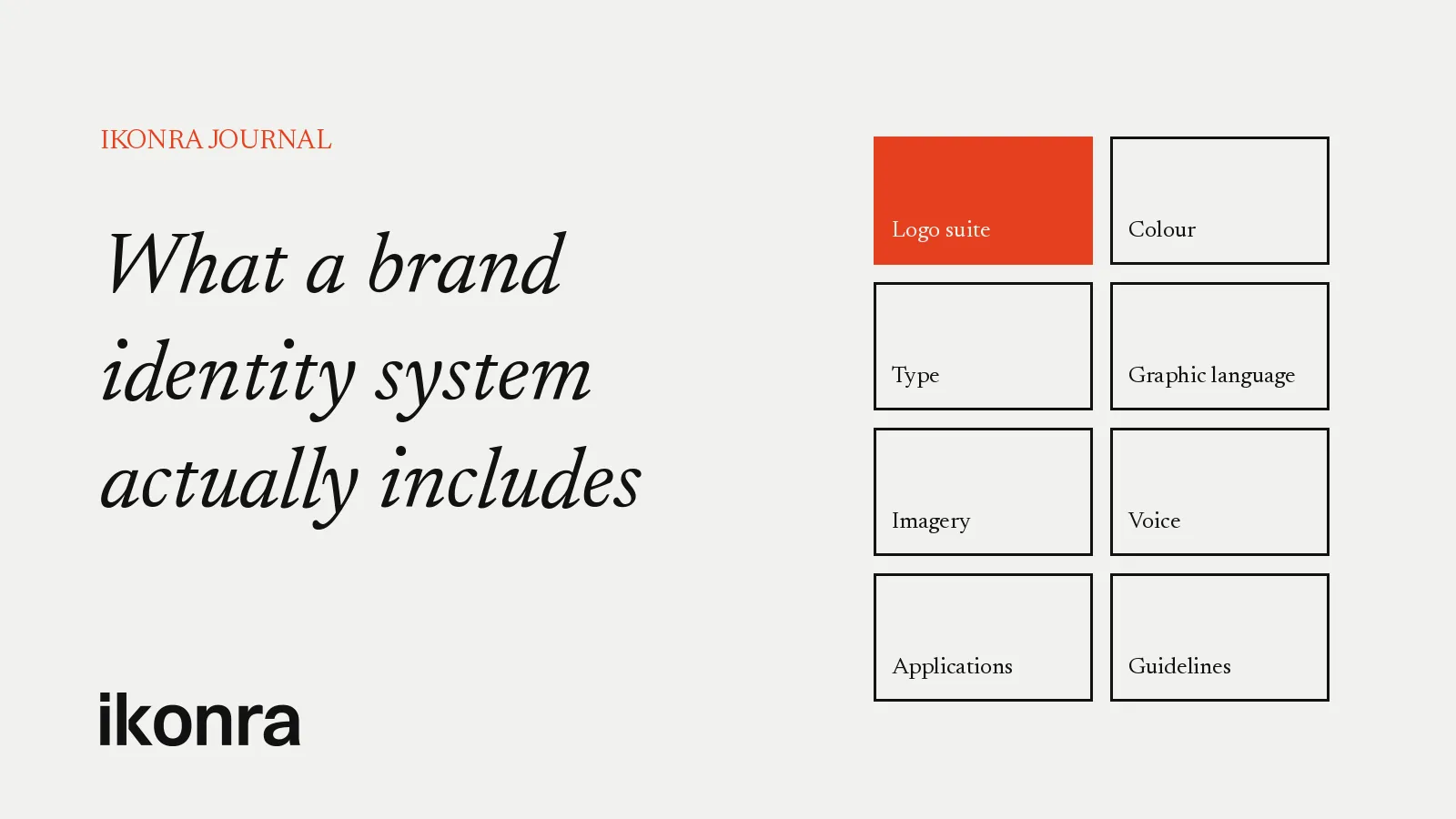
Ask ten founders what a brand identity is and most will point at their logo. That’s understandable. The logo is the part people see first and remember longest. But a logo on its own is a single word. A brand identity system is the whole language: the rules that let your product, your pitch deck, your website and your social posts all sound like the same company, even when five different people made them.
If you’re about to commission a brand, or you’re wondering why your current one feels inconsistent, it helps to know what a complete system contains. Here’s how we break it down in our brand identity design work with startups.
1. The logo suite, not just the logo
A single logo file is rarely enough. Your mark has to work on a dark app header, a light invoice, a square avatar and a tiny browser tab. A proper logo suite usually includes:
- The primary logo, the full lock-up you use when there’s room.
- A secondary or stacked version for narrow or square spaces.
- A symbol or monogram that can stand alone at small sizes, in app icons and as a favicon.
- Colour variations: full colour, single colour, and reversed for dark backgrounds.
- Clear space and minimum size rules, so nobody squeezes it against a button or shrinks it until it breaks.
The test is simple. If someone on your team needs a logo for a new context and has to ask the designer, the suite isn’t finished.
2. Colour with a job description
Most startups have a brand colour. Fewer have a colour system. The difference is that every colour in a system has a role.
A useful palette normally has a primary colour that people associate with you, a small set of neutrals that do most of the actual work, and one or two accents for emphasis. On top of that, product teams need functional colours for success, warning and error states that don’t clash with the brand.
Good systems also specify values for every medium you use: HEX and RGB for screens, CMYK or Pantone where print matters. And they check contrast, so your text is readable for everyone, not just on the designer’s monitor.
3. Typography that scales from headline to fine print
Type carries more of your brand than most founders realise. Your website, your product interface and your deck are mostly words, so the way those words look does a lot of quiet work.
A typography system defines which typefaces you use, which weights and sizes, and where. It sets a hierarchy for headings, body text, captions and labels. It names fallback fonts for email and documents where your brand fonts won’t load.
4. A graphic language
This is the part that makes a brand recognisable even when the logo isn’t on screen. It might be a shape drawn from your mark, a grid, a pattern, a way of cropping images, or a consistent style of line and corner.
For SaaS companies this matters a lot. Your landing page, onboarding screens, feature announcements and ads need visual interest, and without a defined graphic language each one gets invented from scratch. That’s how brands drift.
5. Imagery and iconography
If you use photography, the system should describe what kind: real or staged, people or product, warm or cool, busy or calm. If you use illustration, it should set a style that any illustrator can follow.
Icons deserve their own rules too. Stroke weight, corner radius and grid size should match the logo and the typeface, so your interface icons and your marketing icons feel like one family.
6. Voice and messaging basics
An identity isn’t only visual. The best systems include a short section on how the brand speaks: a positioning line, a few words that describe the tone, and some do and don’t examples. Even one page keeps your website, emails and investor updates far more consistent.
7. Applications
A system is only proven when it’s applied. We like to show the identity working on the things a startup actually uses: website sections, app screens, a pitch deck template, social post templates, email signatures and, where relevant, merchandise or signage.
These applications do two jobs. They show the founder what the brand looks like in real life, and they give the team ready-made starting points so nobody opens a blank file.
8. Guidelines and files people can actually use
Finally, the system needs to be documented and handed over properly. Brand guidelines explain the rules in plain language, with examples of correct and incorrect use. Alongside them sits a well-organised file library: logos in SVG, PNG and PDF, colour values, font files or links, and editable templates.
The best guidelines are short enough that people read them. If your team can find the right logo and the right colour in under a minute, the handover has done its job.
What a startup needs first
Not every company needs every piece on day one. A pre-seed startup with a landing page and a deck needs a different depth of system from a Series A company with a product team, a sales team and an events calendar.
As a rough guide:
- Before launch: logo suite, core colours, typography, a basic graphic element and a one-page set of rules. Enough to look established and stay consistent.
- Around a funding round or a public launch: the full graphic language, imagery direction, deck and social templates, and proper guidelines.
- As the team grows: deeper product and marketing applications, and a system that designers and developers can build on without asking.
The important thing is that the early pieces are designed as the start of a system, not as one-off assets. A logo chosen without thinking about colour, type and small-size use often has to be replaced the moment the company grows. A logo designed as part of a system grows with you.
Signs your current identity is incomplete
If any of these sound familiar, your brand probably has a logo but not a system:
- Your website, deck and product each use slightly different colours.
- Nobody is sure which logo file is the “real” one.
- Every new campaign starts with someone asking what the brand should look like.
- Your app icon is a shrunken version of your full logo that’s hard to read.
- New hires and freelancers create work that feels off-brand, and nobody can explain why.
The point of a system
A brand identity system isn’t paperwork. It’s what lets a small team look like a serious company, and lets a growing team stay recognisable as it adds people, products and markets. Investors, customers and future hires all judge you partly on whether you look consistent and considered.
If you’re planning a new identity or want to turn a logo into a full system, send us a brief at info@ikonra.com. Tell us where your company is today and where it’s heading, and we’ll come back with how we’d approach it.
Ikonra Studio
Brand identity · Logo design · SaaS · Startups
Related services: Brand identity design · SaaS branding
Planning a new brand, a rebrand or a logo that needs to work harder? Send us a brief