(00)
IsarithUsage, drawn as a landscape.
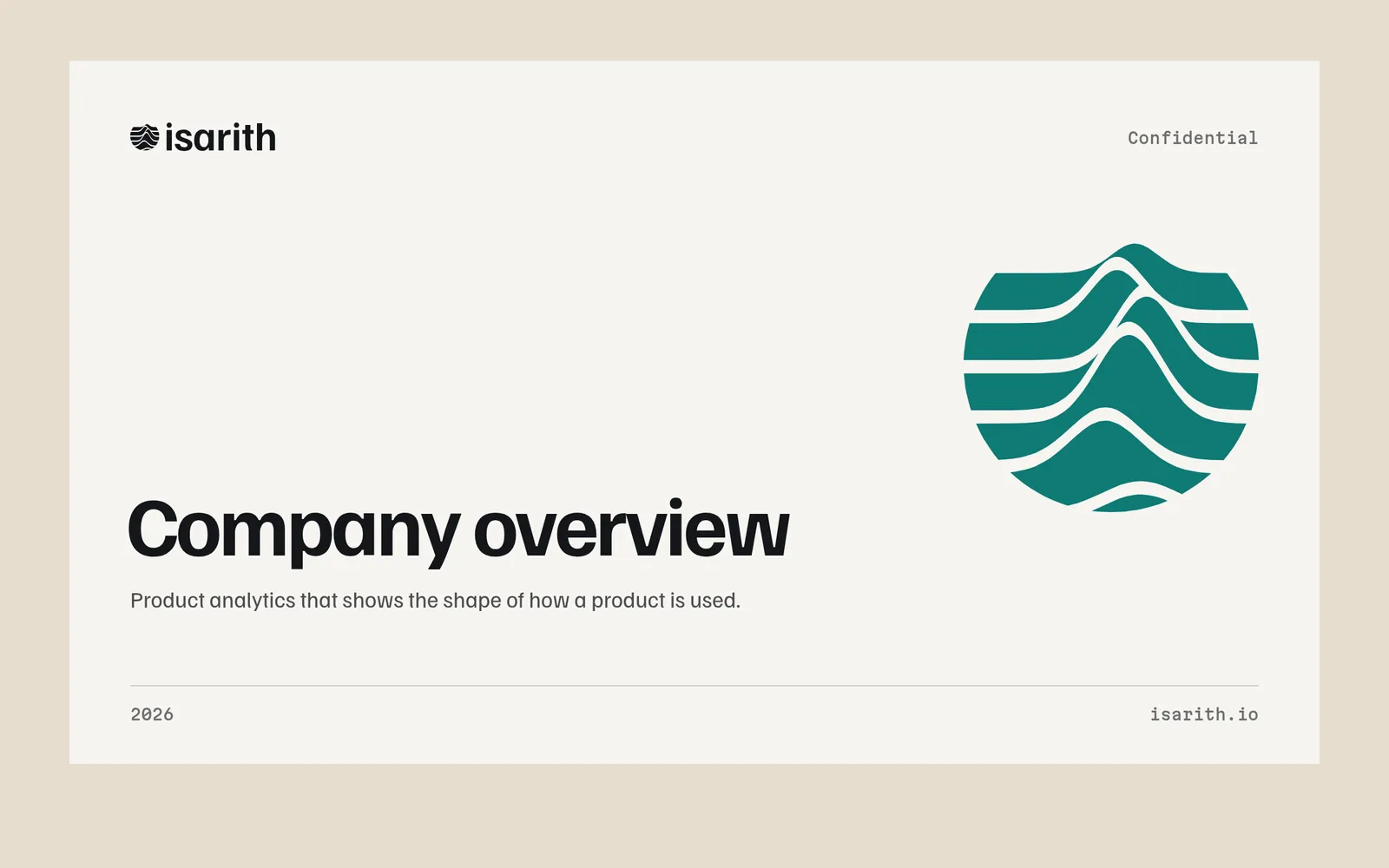
Product analytics that shows the shape of how a product is used.
Concept project. Isarith is a fictional company. This identity is self-initiated work by Ikonra Studio, made to show how we would approach a brief like this. It is not client work, and the brief below is imagined.
(01)
Imagined brief
An isarithm is a line joining points of equal value, the contour on a map. Isarith turns event data into those lines for B2B product teams. The imagined brief: a rebrand ahead of a Series B, to move from 'another dashboard' to a name product leaders bring into board meetings.
It needed a symbol with some depth, and a system that makes charts look like they belong to one company.
(02)
Approach
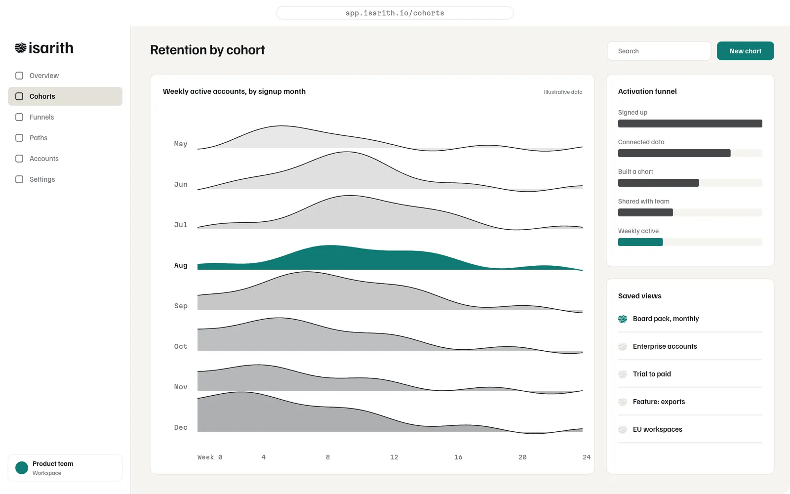
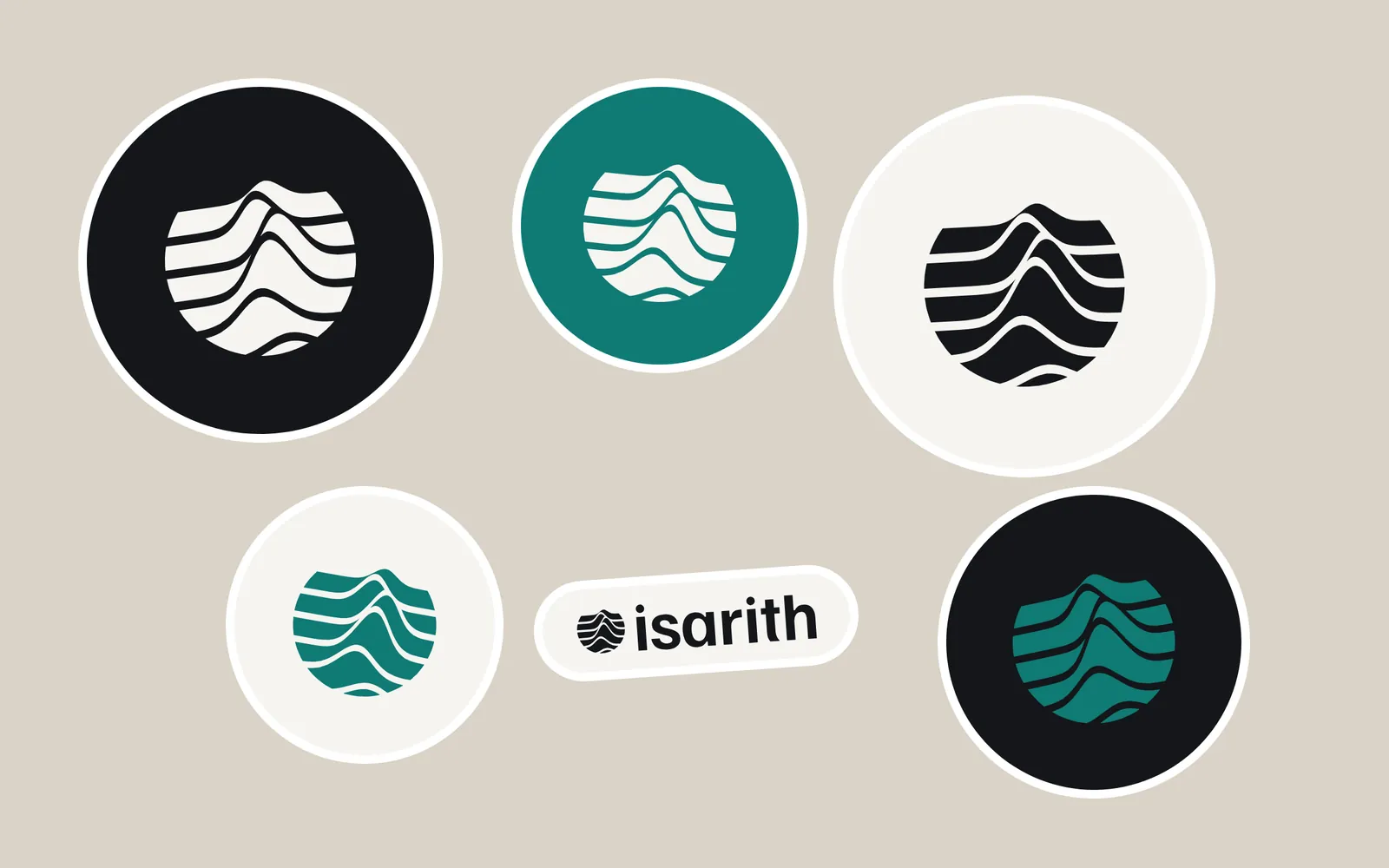
The symbol is a ridgeline plot, the chart analysts use to compare distributions, clipped to a circle so it becomes a small planet of data. Six lines, each a different cohort. At favicon size it reads as a striped disc and keeps its silhouette.
Familjen Grotesk sets the wordmark, with round dots on the i's to echo data points. Martian Mono labels every axis. Contour teal is the single data colour; everything else is ink on survey white.
(03)
Construction
Drawn on a 10-unit grid so the symbol stays exact from a 1024 px app icon down to a 16 px favicon.
- ASix ridgelines, one per cohort
- BClipped to a 100-unit circle
- CGap 4.5 units between lines
Minimum sizes
- 16 px
- 24 px
- 32 px
- 48 px
- Lockup, 20 px tall minimum
(04)
Colour and type
Four colours, each with one job. Two free typefaces, so the team can use them anywhere without a licence conversation.
- Ink#14161APrimary
- Survey white#F6F5F1Ground
- Contour teal#0F7A74Signal
- Clay#E7DDCFSupport
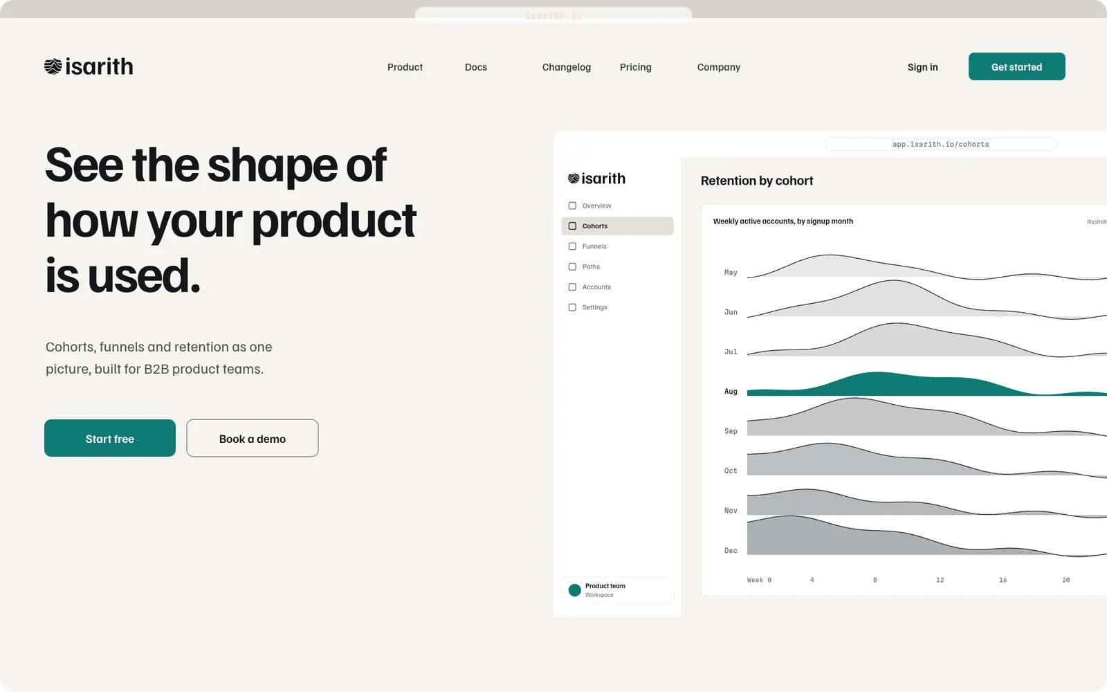
See the shape of how your product is used.
Cohorts, funnels and retention as one picture, built for B2B product teams.
(05)
Applications
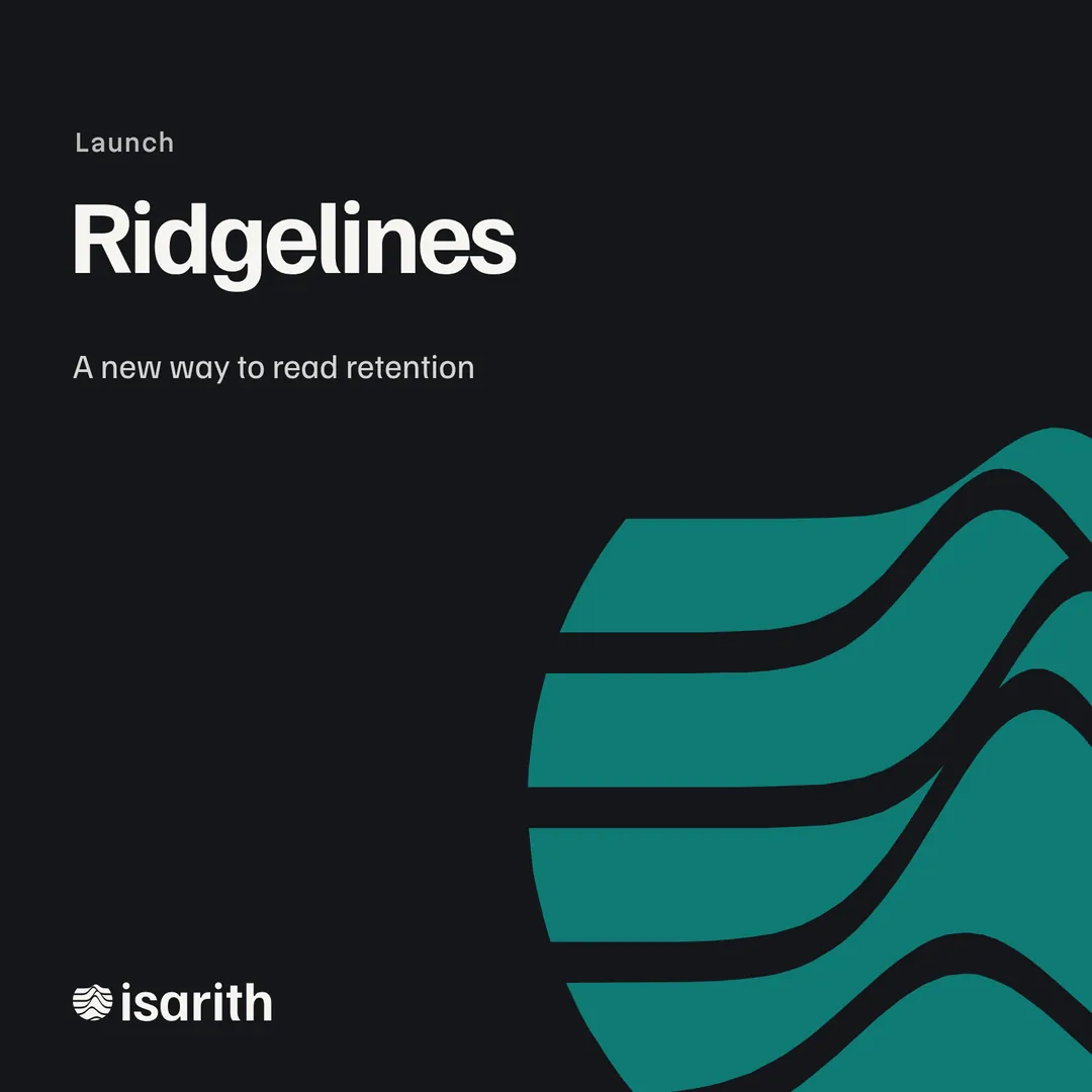
The brand where a funded company actually lives: inside the product, on the website, in the deck and on the launch post. Names and figures in the interface are illustrative.
(06)
Deliverables
- 01Symbol and wordmark
- 02Data-visualisation palette and chart rules
- 03Colour and type system
- 04Product UI theme
- 05Website hero
- 06Pitch deck template
- 07Sticker sheet
Raising, rebranding or launching? Send a short brief and you will get a written proposal with a fixed fee.
Send a brief