(00)
KerrowA K drawn as a care schedule.
Care coordination for clinics: appointments, follow-ups and handoffs.
Concept project. Kerrow is a fictional company. This identity is self-initiated work by Ikonra Studio, made to show how we would approach a brief like this. It is not client work, and the brief below is imagined.
(01)
Imagined brief
Kerrow coordinates appointments, follow-ups and handoffs between clinicians, so patients do not fall through the gaps between visits. The imagined brief: a brand ahead of a Series A, for clinic managers and clinicians who are tired of software that looks like a hospital corridor.
It had to feel calm, human and clinical at the same time, without a blue cross in sight.
(02)
Approach
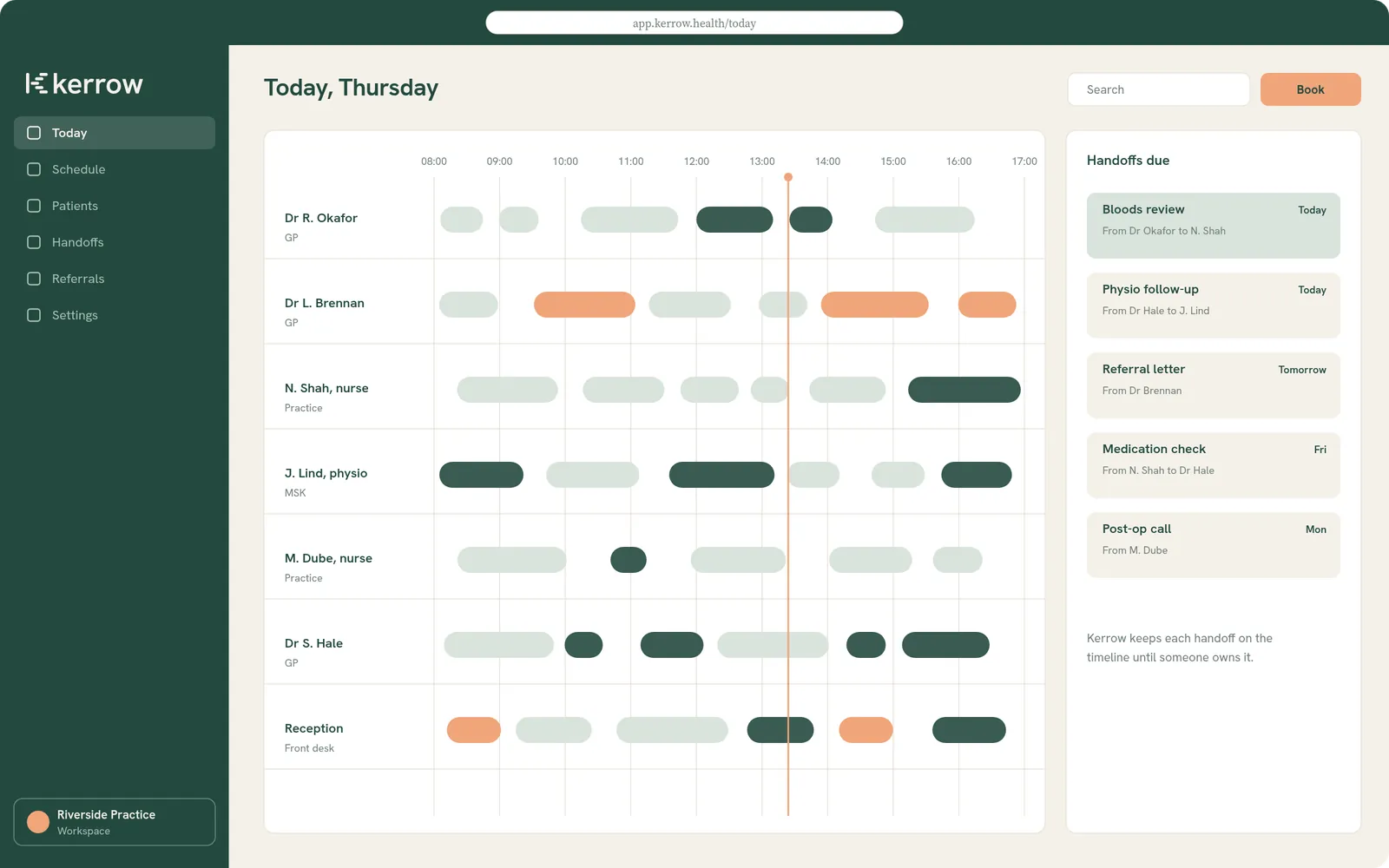
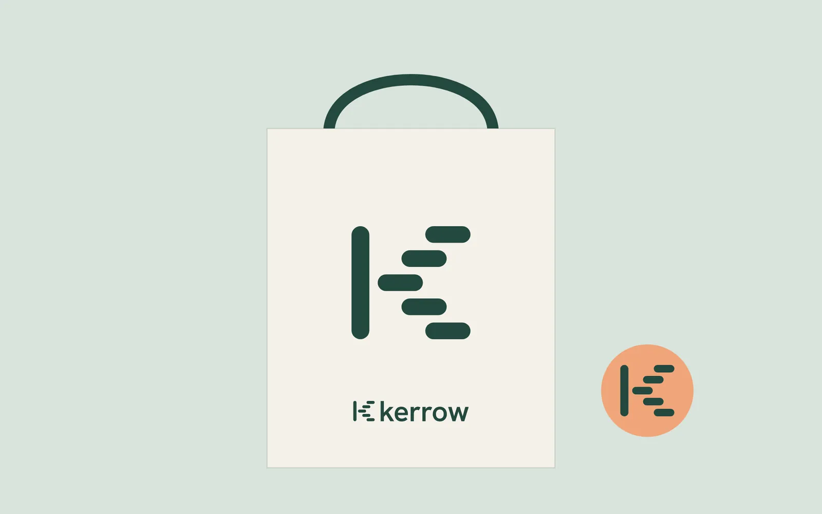
The K is built from a care schedule. A stem, then five appointment bars that step in and out like a timeline view, which is exactly what the product shows. It is friendly at app-icon size and still reads as a letter.
Hanken Grotesk is warm and clear for interfaces; Source Serif 4 gives patient letters and headlines a human voice. Deep sage and chalk replace hospital blue, and apricot marks the next thing that needs doing.
(03)
Construction
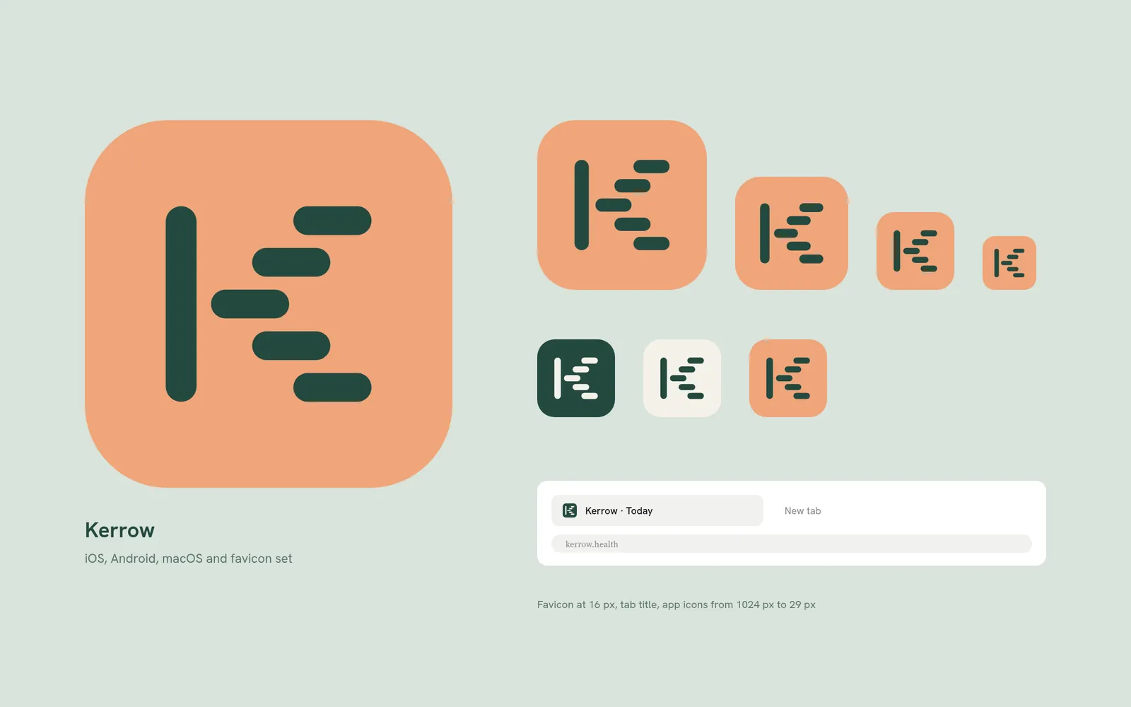
Drawn on a 10-unit grid so the symbol stays exact from a 1024 px app icon down to a 16 px favicon.
- AStem 15 units, bars 14 units
- BBars 38 units: a standard slot
- CSteps of 20 units trace the K
Minimum sizes
- 16 px
- 24 px
- 32 px
- 48 px
- Lockup, 20 px tall minimum
(04)
Colour and type
Four colours, each with one job. Two free typefaces, so the team can use them anywhere without a licence conversation.
- Deep sage#23493FPrimary
- Chalk#F5F1EAGround
- Apricot#F0A57ASignal
- Mist#D9E3DCSupport
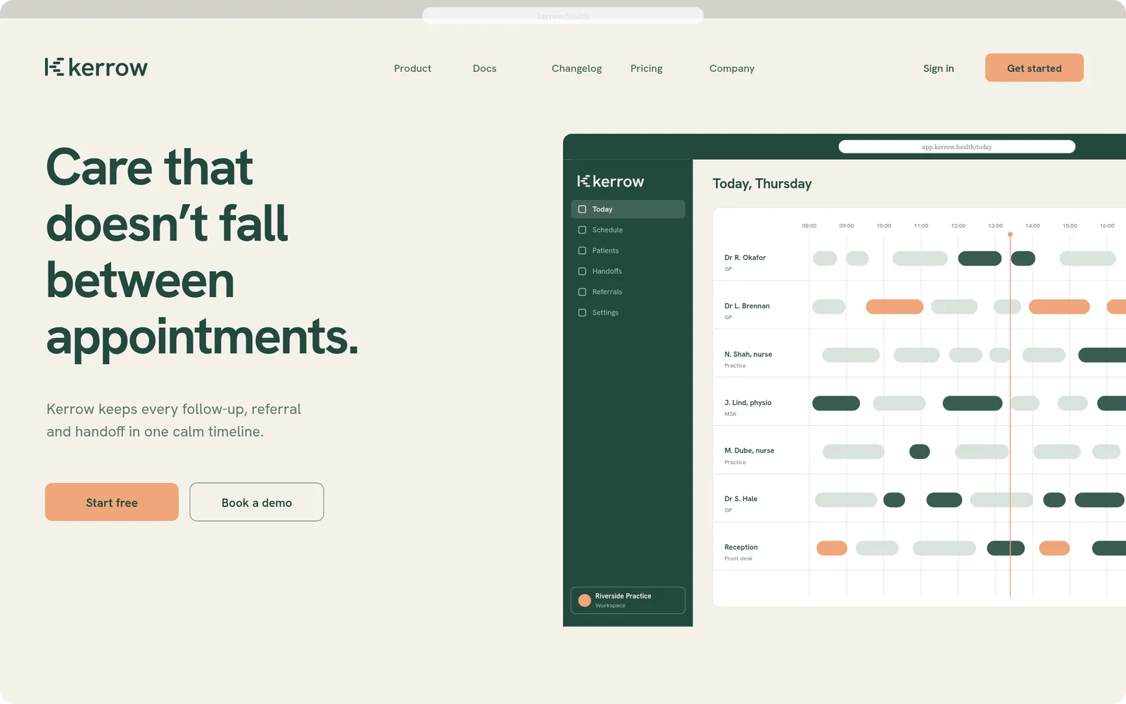
Care that doesn’t fall between appointments.
Kerrow keeps every follow-up, referral and handoff in one calm timeline.
(05)
Applications
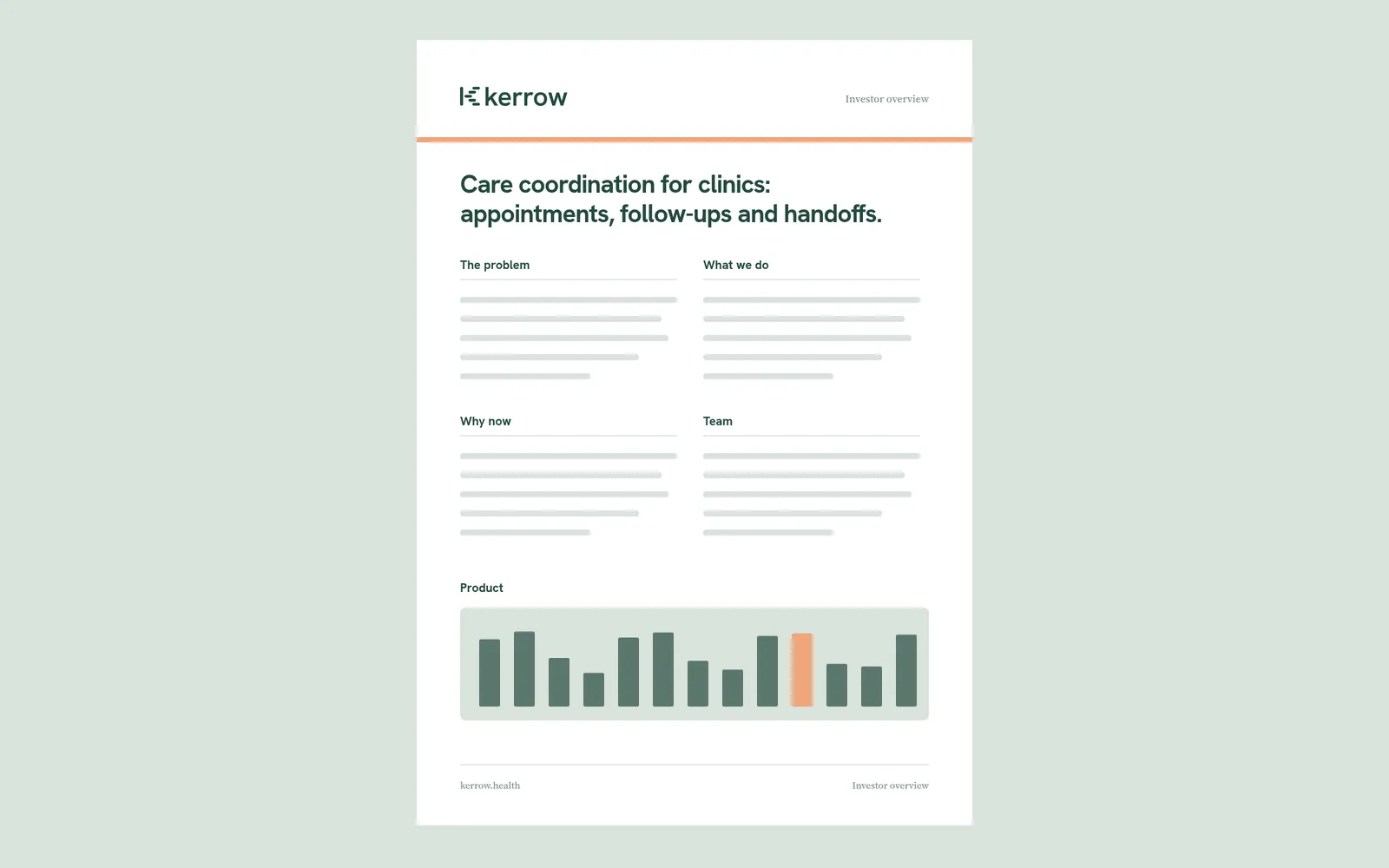
The brand where a funded company actually lives: inside the product, on the website, in the deck and on the launch post. Names and figures in the interface are illustrative.
(06)
Deliverables
- 01Symbol and wordmark
- 02App icon and favicon set
- 03Colour and type system
- 04Product UI theme
- 05Patient letter and appointment templates
- 06Investor one-pager
- 07Clinic tote bag
Raising, rebranding or launching? Send a short brief and you will get a written proposal with a fixed fee.
Send a brief